Demographic and economic shifts across world regions
Over the last two centuries, the scale of human societies has expanded exponentially, driven by growth in both population and per-capita output (resource use). This has been true especially for the period since the second world war. On the global level population has increased approximately 8-fold in the last 200 years and the global average of per capita output approximately 15-fold - the latter figure masking enormous regional differences of course.
What I want to explore in this post is whether these exponentials look similar in countries that are high income (today) compared to others that are middle or low income. In other words, was there an exponential increase in population and productivity of 1) a similar (relative) magnitude and 2) on a similar timescale across all or most world regions? Are low income countries on the same trajectory as high income ones, just somewhat behind or do these exponentials look different in time?
I used historical estimates of GDP per capita in purchasing power parity (PPP) terms (ie. corrected for price differences) as a proxy for per capita output/income. I will use the terms output and income intechangeably - ‘income’ should not be understood as labour income, but rather all income per capita in a given society. In this broad sense the output=income equality should hold.
First, let us look at the fold changes in population and per-capita-output by country, calculated from the earliest year since 1800 for which estimates are available for both variables.
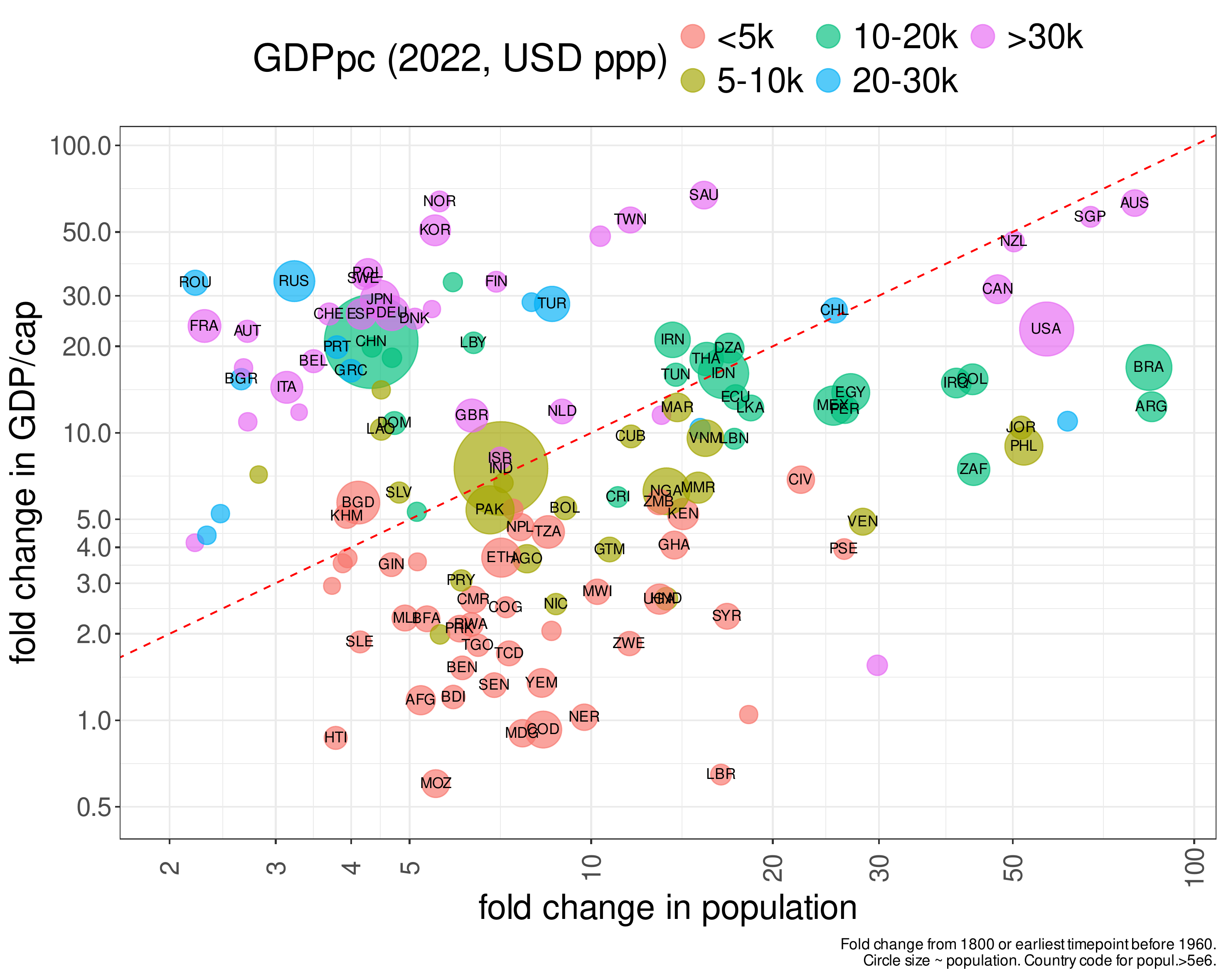
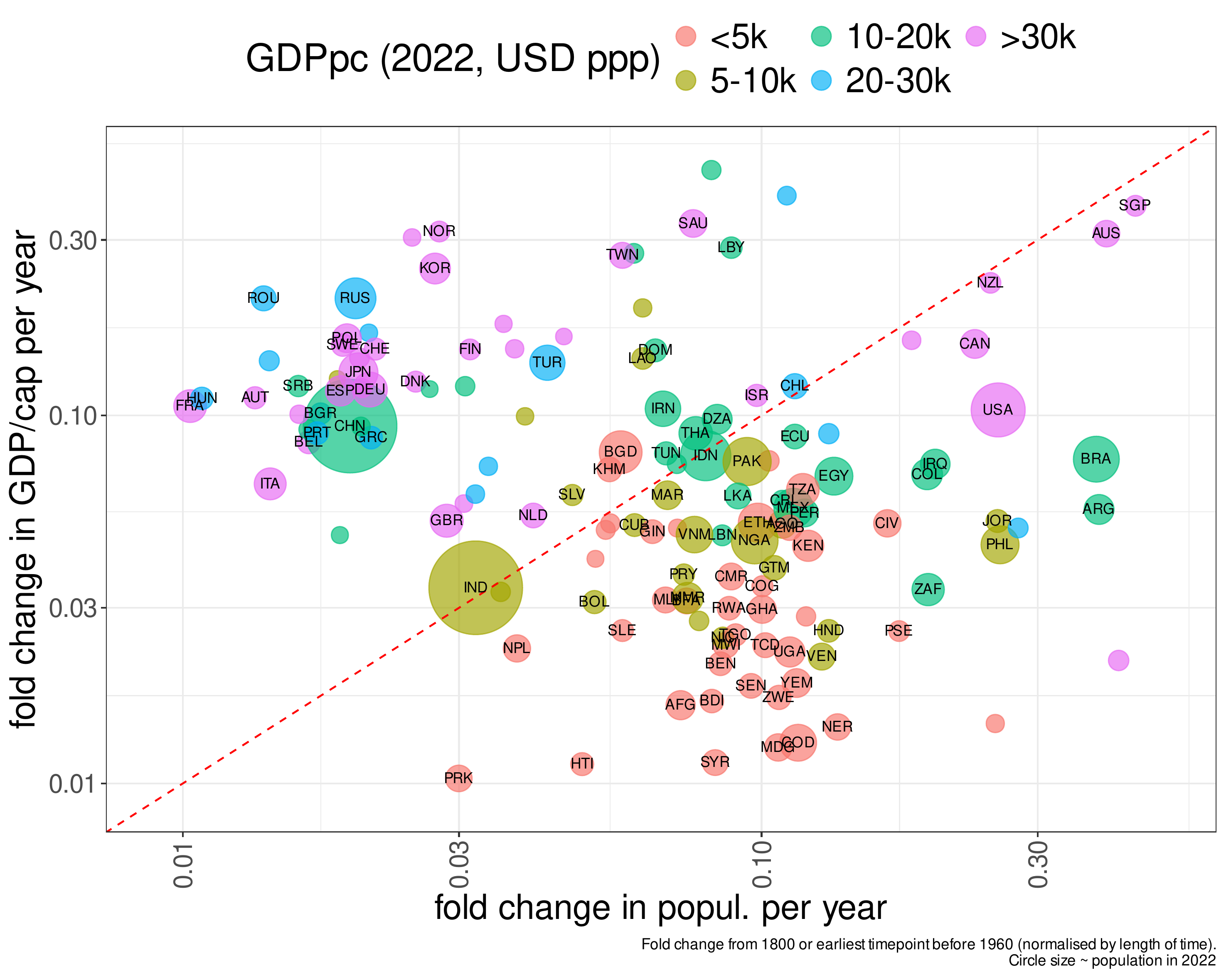
The diagonal (red dashed line) is where the fold changes for the two variables are identical. Unsurprisingly, the fold change in GDP/capita is the biggest for high-income (>30k USD) and upper-middle income (20-30k) countries and lowest for low-income countries (<5k USD PPP). For population the picture seems more complex, with some high, middle (10-20k USD) and lower middle (5-10k USD) countries showing the largest relative increases, while high-income and upper middle income European countries the smallest. There is an issue though with this plot: since the start year can be different, we are comparing fold changes for different lengts of time. We can normalise by length of time to see if this matters.
This does not seem to change the overall picture: high-income Western European and upper-middle income East European countries, as well as China are clustered to the left, above the diagonal, meaning higher per-capita income/output growth than population growth.
Low (<5k) and lower-middle (5-10k) income countries are almost all below the diagonal, ie. they have had more population growth than per-capita output growth. Middle income countries (10-20k USD per capita) are mostly along the diagonal: similar levels of income and population growth. The big exception here is China, which is to the left of the diagonal.
There are also a number of high-income countries towards the upper right corner, close to or below the diagonal. These are countries that were settled by (mostly) Europeans and (mostly) had large territory: the US, Canada, Australia, New Zealand, Brazil and Argentina (also Singapore - a city-state, that is quite a different story).
Figure 2 can be seen as a proxy for the average growth rate in population and output-per-capita, but it does not tell us how this process unfolded in time. We know that the process is exponential (or indeed super-exponential), ie. it is not a gradually increasing curve across a long period, but rather a long period close to a baseline and then a steep rise.
Let us turn to the dynamics in the next plot.
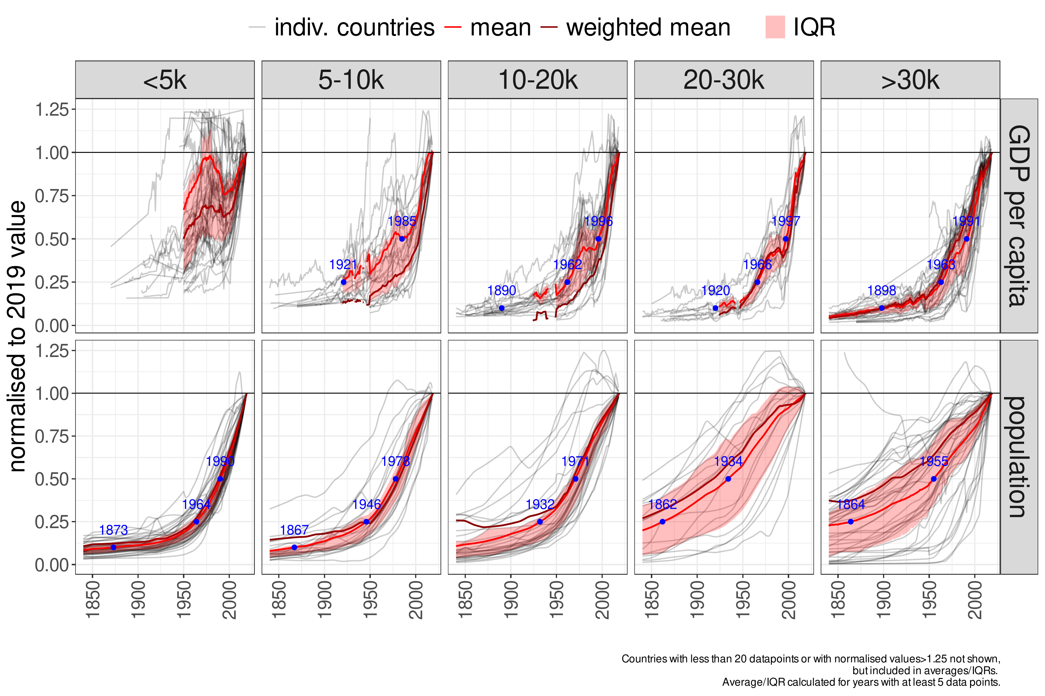
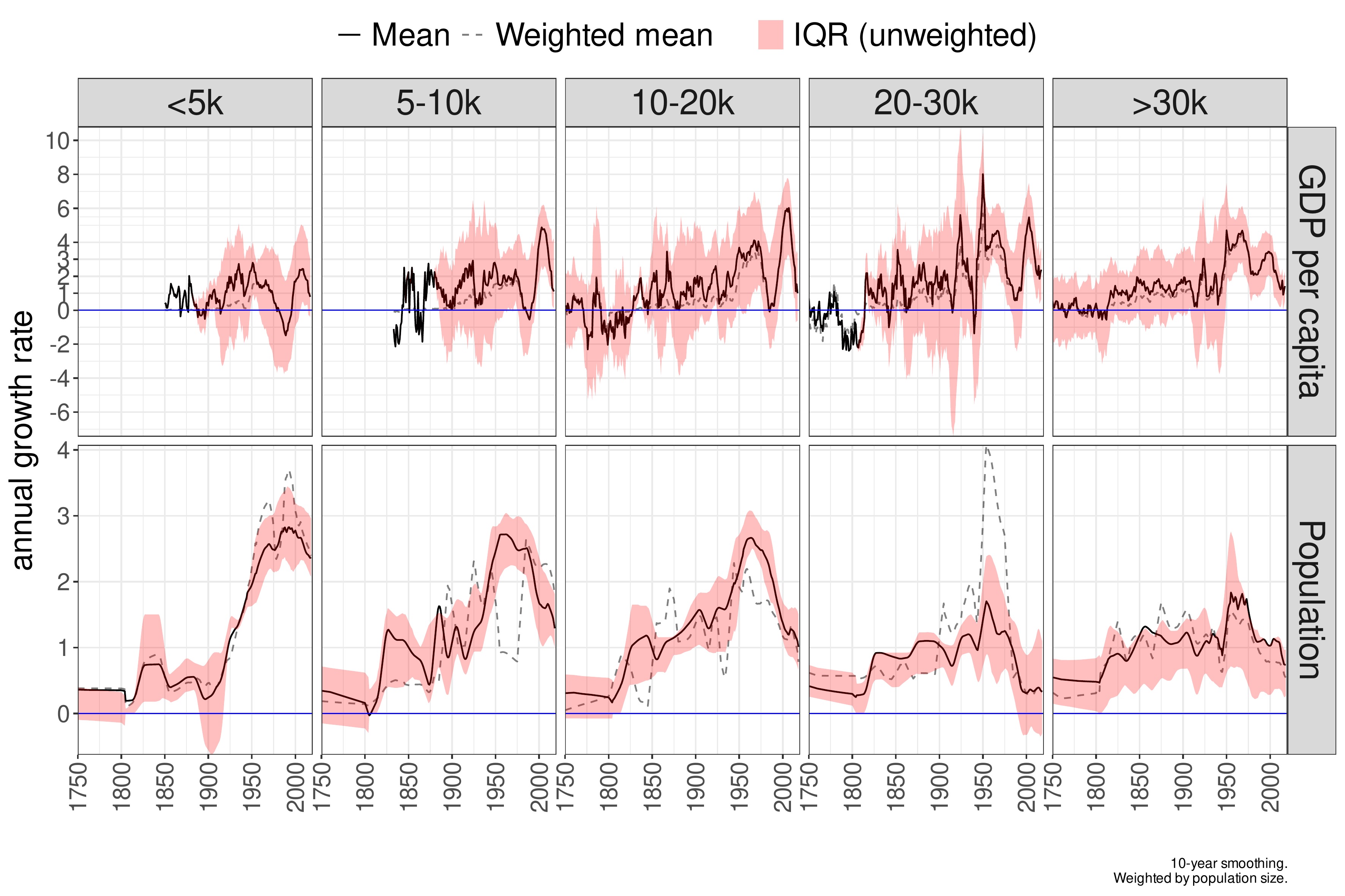
Figure 3 shows individual trajectories, along with both the simple and population-weighted averages. First thing to note is that GDP/capita estimates before 1950 are scarce for lower and middle income countries, whereas population estimates go back longer. The population curves show some differences moving from low to high income countries. In low income countries the exponential increase in population is much more recent: only in 1990 the (average) population level was just half the latest value, and in 1964 it was only 25%. At the other extreme, high income countries (>30k USD GDP/capita), the (weighted) average population level was around half the current (2019) value by 1900, and already around 40% by 1850. In other words, in the latter group the population increase began earlier and occurred over a longer period. Doubling took approximately one century, and a fourfold increase nearly two centuries, whereas the same occurred in just 30 and 60 years in low income countries. Moving from low to high income countries, we can observe a more or less gradual transition between these two patterns.
Estimates for per-capita-output are much noisier and scarcely available before 1950 for low(er middle) income countries. Nevertheless, a perhaps surprising difference we can see is that the relative increase has been much smaller in the lowest income (<5k USD) countries since 1950, although they started from a lower basis. Whereas high and middle income countries have seen their GDP/capita level quadruple (4x) since approximately 1960, the increase is only two-fold in the lowest income group. In addition, trends in the latter are much noisier, with a fall in the income level (not just the rate of growth) in many countries in the 1980s, though followed by a strong bounceback up to the COVID pandemic. In middle and high income countries per capita output has increased approximately 10-fold since the beginning of the 20th century.
To highlight these differences in the population and output level trends, we now plot only the population-weighted averages, shown together for all groups on the same panel — one for each variable:
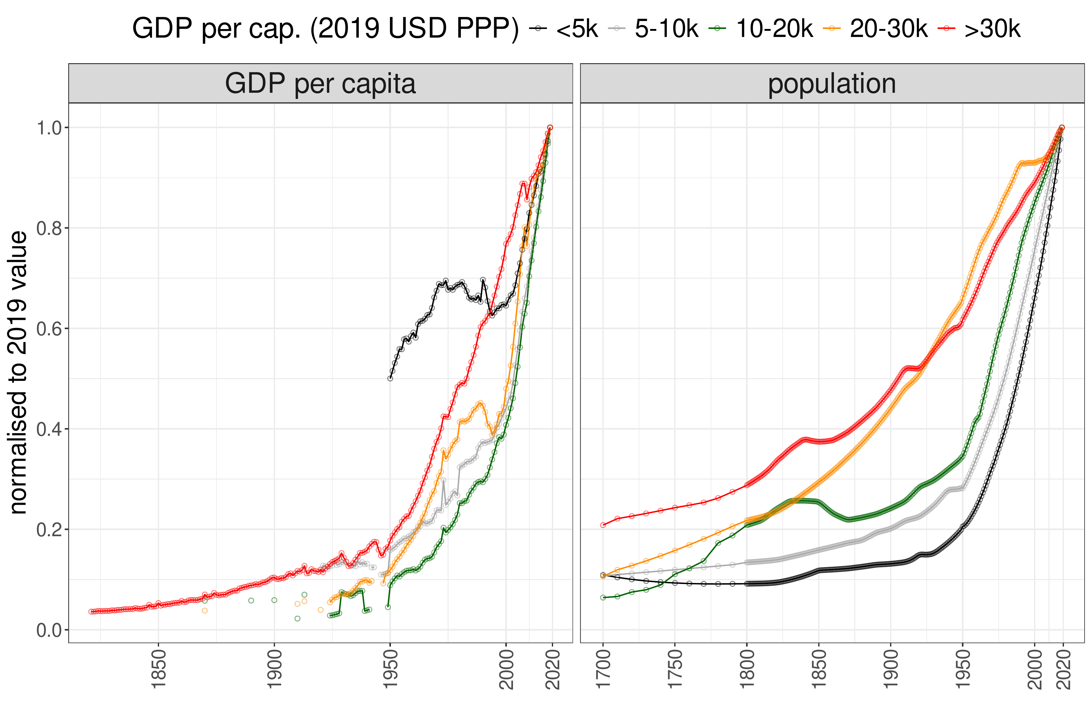
For per-capita-output what we can observe again is that it rocketed upwards across the lower middle to high income groups from 1950, but has shown a much less consistent trend for the lowest income (<5k USD PPP) countries. For high income countries, where estimates are available going back further, we see a consistent but slower upward trend from the early 19th century, but ramping up dramatically after WW2. For population, there is an inverse relationship between income level and how compressed the exponential process is. In rich countries population has reached its current level over centuries, and already by 1700 it was (on average) at 20% of today’s level. In the lowest income group this (relative) level was reached in around 1950: 70 years ago, instead of 300.
Finally, let us look at the temporal pattern of annual growth rates, already suggested by the last two plots:
First, neither process is strictly speaking a simple exponential, as then the relative rate of change (annual growth rate) would be constant:
Instead, the annual growth rate is near-zero first, then rises steeply, and subsequently falls. In other words, both population and per-capita-output show first super-exponential behaviour (rate of growth increasing), followed by saturation.
Let us look at growth rates of the two variables in detail. In the case of population, low and lower middle income countries show growth rates mostly in the 0.5-1% (per year) range up until the 20th century. From the interwar period there is a spike and the rate of growth goes to ~3%. In the lower middle and middle income groups the rate then sinks back towards 1%, but up until now has still remained in the 2-3% zone in the lowest (<5k USD) income group, although started to move downwards. Upper middle and high income countries showed a growth rate of around 1% from the early/mid-nineteenth century, with a brief spike from 1950 above that level, quickly falling back below 1% afterwards. In summary, population growth rates in low/lower middle income countries reached higher levels than upper-middle/high-income countries and still remain there for the lowest income countries, but have already come down in the lower-middle income range.
For output-per-capita annual growth rates are much noisier, even with 10-year smoothing, and there is little data (except for upper-middle/high-income countries) before 1950. Up until the 1820s there is no consistent growth in the high-income country category either. Following that, the annual growth rate rises to approximately 1% and stays there until 1950, when it rises into the 3-4% range. Following the mid-1970s there is a downward shift to around 2%, followed by a smaller spike in the 1990s, then trending downwards to 1%. In the lower middle to upper middle range, we see similar patterns post-WW2 but with larger oscillations, which however also includes a period of stronger growth around 1990s, also followed by a downward trend towards 1% following the GFC. In the low income category the annual growth did not stay consistently above 2% and fell below zero in the 1980s, followed by a bounce-back to 2%, but declining to 1% again after the GFC.
Takeaways
Long-term trends of population size
- the biggest population increases in the last two hundred years were in settler states like the USA, Canada, Australia, Argentina, Brazil, Chile, Colombia, South Africa and lower-middle income countries with large territories like Egypt, Iraq or the Philippines
- in these countries the population increase has been 20-100 fold
- high-income European countries have generally seen a smaller (2 to 5-fold) population increase that happened more gradually, over approximately two centuries
- very low income (<5k USD PPP, mostly African) countries are in the middle range (5-20x) in terms of population fold change
- the population increase in low- and lower-middle income countries occurred in a much narrower period, almost entirely in the post-war era: they have seen their population quadruple in the last 60-80 and double in the last 30-50 years
- there appears to be an inverse relationship between current income level and the temporal compression of the population increase: it occurred over the shortest timespan in very low-income countries and the longest in high-income countries, with other country categories falling in between along this gradient
- in low and lower-middle income countries the population growth rate reached ~3% in the post-war period, a rate not experienced in upper-middle and high-income countries (with a few exceptions)
- in lower-middle income countries population growth rate quickly fell back to ~1% from the 1970s, but is still in the 2-3% range in countries with lowest GDP/capita levels (<5k USD PPP), although appears to be slowly falling since 2000
Long-term trends of income levels
- per-capita-income growth has accelerated similarly after 1950 across lower-middle, middle, and high-income countries, with levels increasing five- to tenfold; ie. after WWII these countries were at just 10–20% of their current income levels
- high income countries already had a ~100 year period of ~1% per-capita-income growth before 1950, however their post-war growth trajectory accounted for over 80% of the total increase to their current income level
- for the lowest-income (<5K USD PPP) countries data on GDP/capita is scarce before 1950 and noisy thereafter
- it appears that these countries roughly doubled their income levels since 1950 - starting from a lower base - compared to a 5- to 10-fold increase in per-capita-income for the other country groups
- the growth rate of the <5k USD PPP group collapsed from the late 1970s, bouncing back from 1990s, but trending downwards again since the GFC
Conclusion
This analysis presents a descriptive overview of long-term macro-trends in population and per-capita output across countries at different income levels today. While we could identify some differences in the shape, timing, and magnitude (fold-change) of these trends, the analysis does not aim to provide causal explanations. Both population growth and economic output are shaped by many underlying processes, and developments across countries are also interconnected. Understanding the causes behind these patterns would require further analysis and a different analytical approach. Here, the goal has been to show to what extent these macro-trends differ across contexts, and to give a sense of the proportions and time scales involved.
Code base and data sources
R code for graphs
Data source: population
Data source: GDP-per-capita
demographics data-visualisation ecology growth gdp population